Just a little bit of oil...
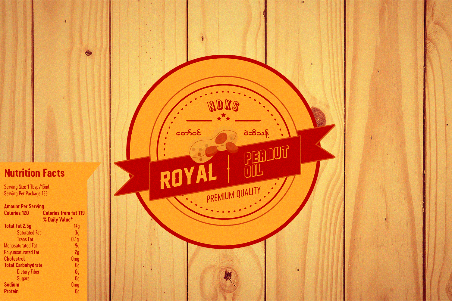
A few months later after a Cougar brand design, my uncle asked my help again to design another logo for his next project. This time a serviceable logo for the peanut oil production. I begun searching for references and examples of other works to get familier with this kind of logo style. The majority of these businesses tend to use old, authentic vintage look to their designs such as emblem logo type. It help the viewers see clearly of what kind of product they are selling, contrary to today’s style of applying minimalistic or abstract shape designs to company logos. Moreover, these kind of business logos put established date to signify the longevity of their business, even i saw a few companies using this melthod although their founding period is recent. For my design layout, i decided to incoporate a retro look to my logo, using minimal color group which only consists of orange yellow and scarlet red colors. I was more composed at this time with illustrator, making my workflow much more effecient. My final product looked like a balanced mix of vintage and modern design, and standout to other local brand logos because the addition of peanut doodle and stylized typo in my design have not been used by most of them.
Main Logo